The Big Updates
A Redesigned Interface
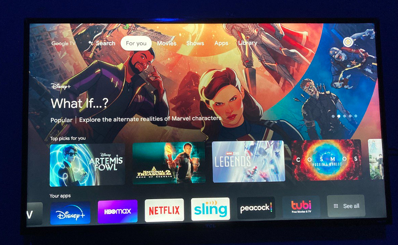
If you own a smart TV running Android TV, you will be used to a layout with different rows of apps and content suggestions. Google TV, on the other hand, is designed with a content-focused interface. The home interface feature large image on the home screen, sitting side-by-side, row after row, showing you movies and shows recommendations. All of the recommendations you will see are drawn from your preferred types of content from the streaming services you actively use and the shows you watch. I particularly like the new interface because it looks a lot more clean and the fact that it has a content recommendation functionality, I can easily find content to watch, instead of always searching for them app by app.
You Can Now Watch Live Content
Google is bringing Live TV streaming to Google TV for smart TVs – a feature we didn’t get on Android TV. Google has partnered with top streaming services like YouTube TV, Pluto TV, Sling TV, Philo and Plex. Now, you can see live content; Live news, reality shows, sports, etc, on your Google TV. Although, as at the time of writing this article, this features is, unfortunately only available in the U.S to U.S users. Get access to it outside the U.S will require VPN. Google TV comes with other features like the virtual remote control that lets you use an Android phone as a remote control for your Google TV, the individual user profile feature that’ll let family members get tailored recommendations, built around their own viewing interests.

