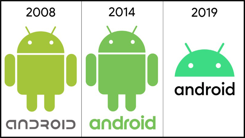
This change was announced as a part of the company’s update of the Android brand to make it more inclusive, more accessible, more intuitive, simpler, and ultimately better in a blog post by Google’s Vice President of Product Management, Android, Sameer Samar. Android versions will now be branded using numbers (Android 10, Android 11, Android 13, and so on.) because the old dessert-naming system wasn’t always understood by all Android users across the globe. Google says it made the change based off feedback it received from several users in the global Android community over the years. Google believes that “Android 10” will be a much simpler and relatable names that could easily be pronounced and associated with by billions of people using its OS across the globe. With the change in naming system also comes a rebrand of the Android logo. The typography, colour, and wordmark of the Android logo have been reconstructed by Google to make it more readable (particularly on smaller screens) and more accessible. The most prominent change in the logo is the colour. Google changes the colour of the official Android logo from Green to Black because it discovered that some people with visual impairments found it difficult to read the green Android logo. I find the rebrand of Android particularly interesting and commendable because —as always— it signifies that Google pays attention to how people interact with their product and how it affects their lives. Google will commence usage of the rebranded Android logo in the coming weeks, when the Android 10 is launched.

